CZECH ORIENTEERING
Moving through nature, designed for the future
A dynamic brand system built for the next generation
2024/2026
BRAND / CONTENT DESIGN / REEL / ART DIRECTION / MERCH / MASCOT
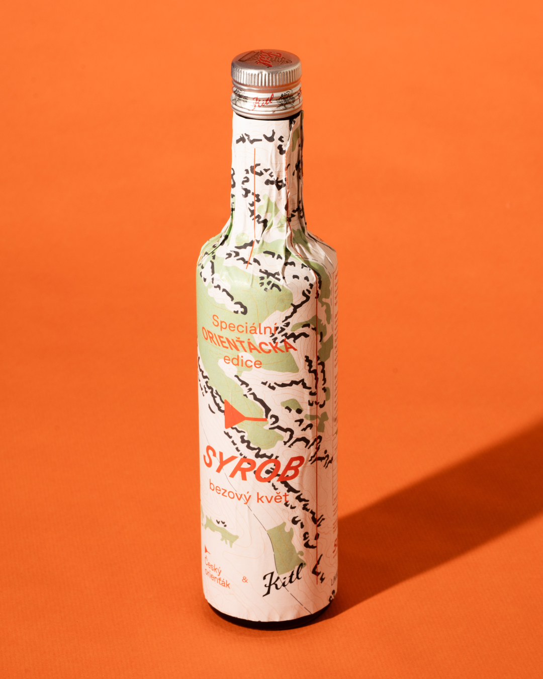
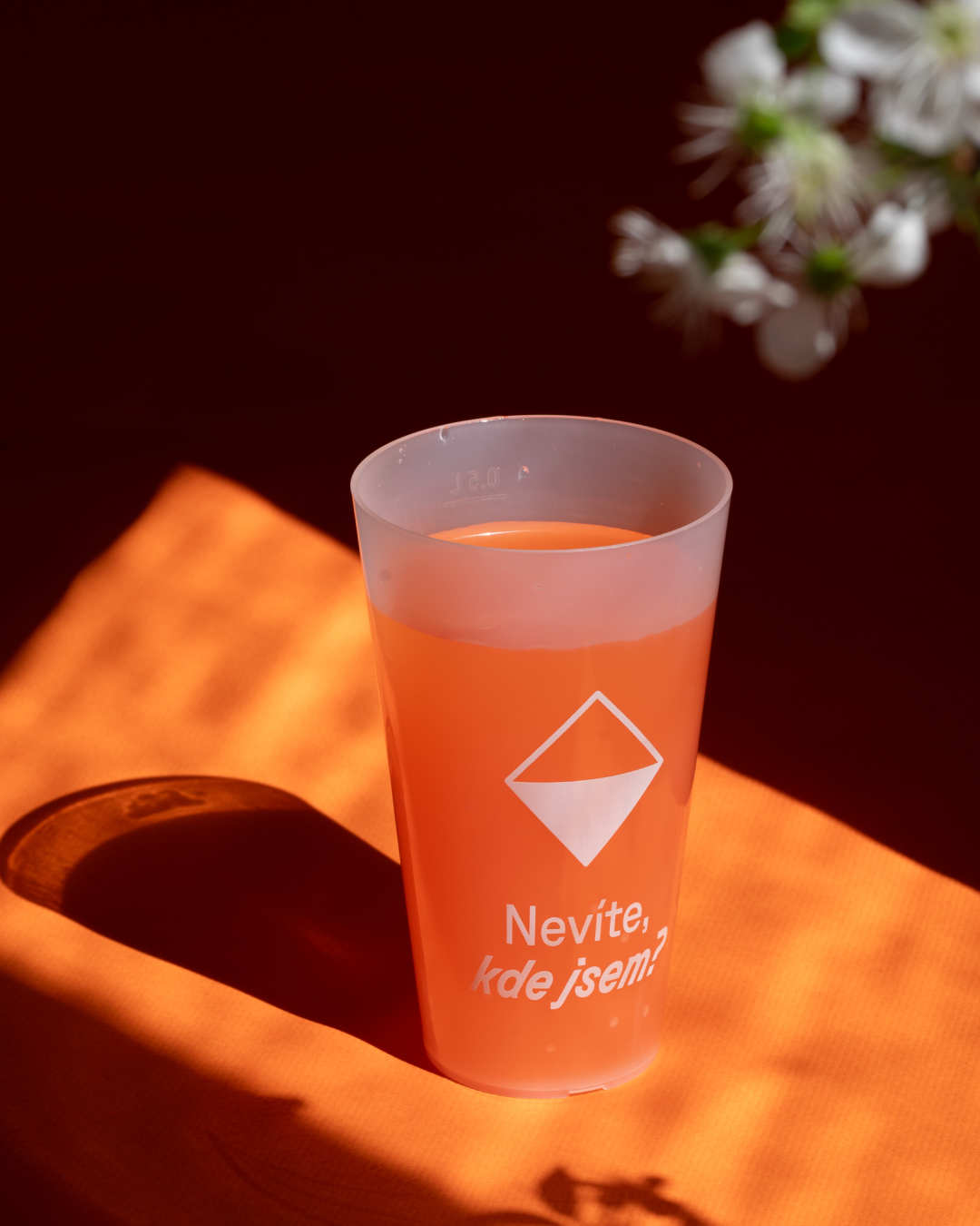
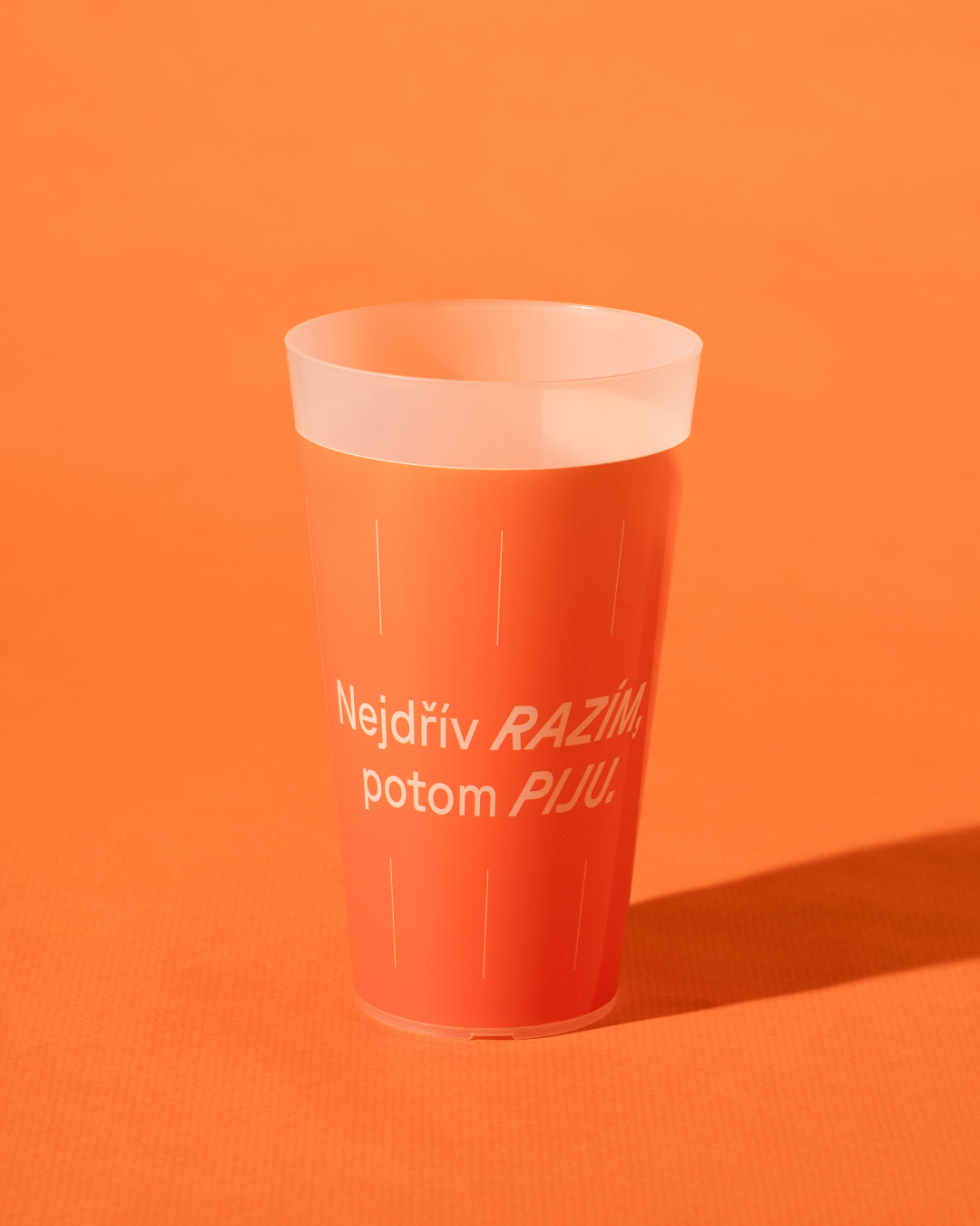
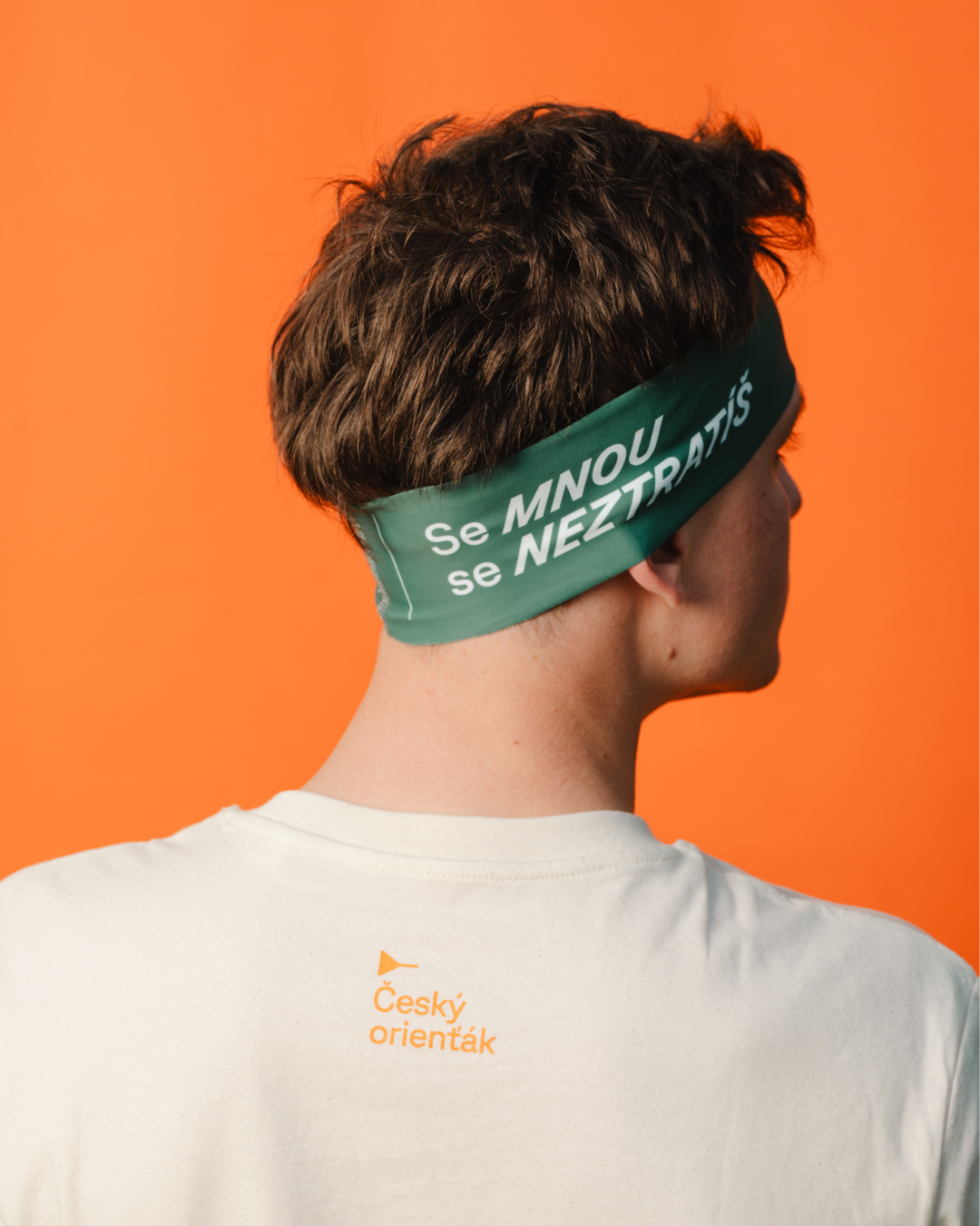
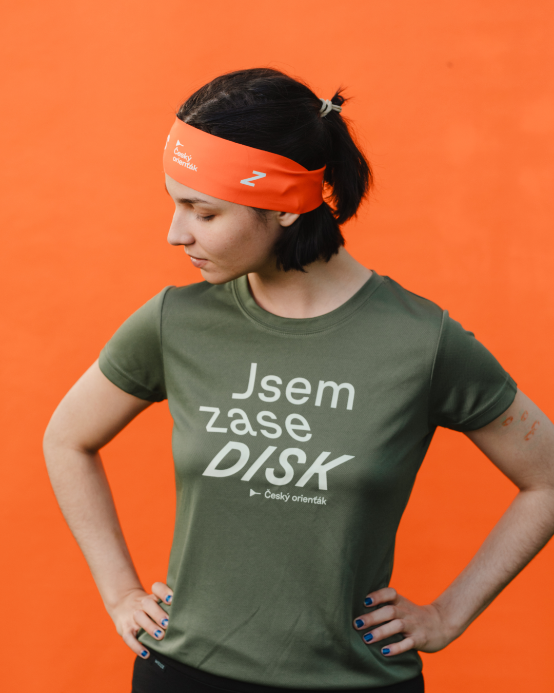
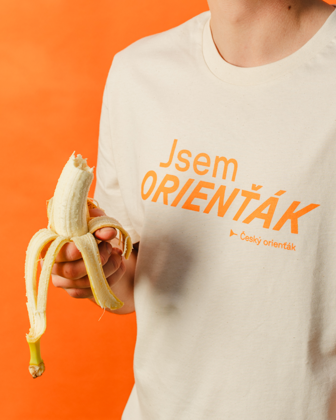
Czech Orienteering’s identity combines community, nature, and adventure. We created a logo merging the start symbol and Czech flag, with iconic orange and map lines for clarity. A mascot engages younger audiences, and the streamlined design unifies communication across sub-brands.
IDENTIFY
The identity of Czech Orienteering is built on the balance between athletic precision and a deep connection to nature. We focused on the core values of the community—adventure, family atmosphere, and the unique unpredictability of the forest. Our goal was to create a visual language that feels authentic to the runners while establishing a professional presence within the national sporting landscape.


DESIGN
The system centers on a symbol that merges the traditional orienteering "start" mark with the geometry of the Czech flag. This new icon, anchored by the sport’s signature orange, ensures instant recognition across all materials. To create a cohesive look, we integrated map-inspired north-south lines into the layouts and introduced a custom set of illustrations to make the brand more approachable for the next generation.


From forest trails to a unified visual language: Bridging the gap between athletic precision and the raw energy of nature
IMPLEMENT
With a wide range of sub-brands under the Czech Orienteering umbrella, we focused on streamlining and unifying the entire communication style. The result is a clean, modular system that works seamlessly from local club level to international championships, representing the sport with clarity and pride both at home and abroad.